Android's big blur finally gets an off switch—soon.

Android’s redesign arrived like a watercolor splash on the home screen, blurry enough to make your thumbs question their own sanity. Google promised a forthcoming toggle to switch off the blur, apparently after you finish assembling the coffee table of your life. In other words: brace for frosted glory.
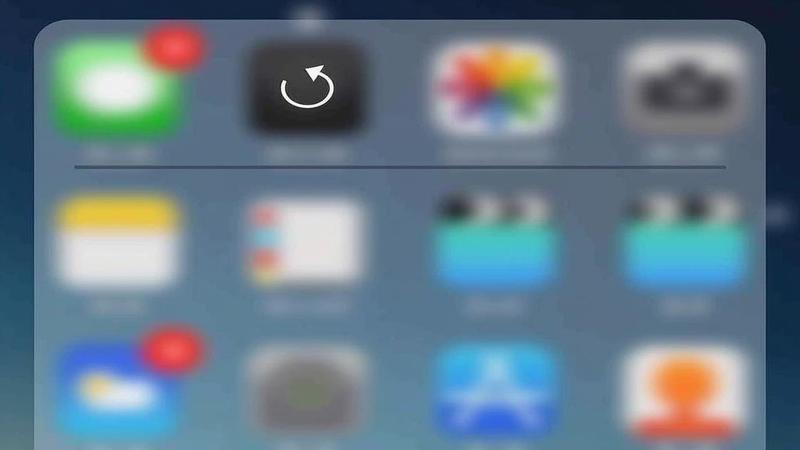
The UI team markets this as bold and dynamic, which insiders translate as ‘we couldn’t agree on icon size, so we smeared everything together.’ Early testers report that apps resemble art installations you can’t quite walk through. The net effect, they say, is focus that travels at the speed of fog.
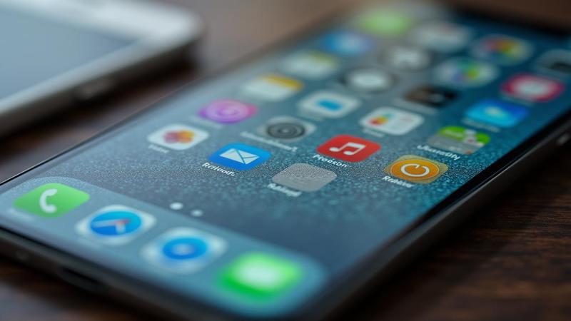
Notifications arrive as if printed on fogged glass, forcing you to guess which app pinged. Some users squint at the status bar and pretend they’re decoding ancient runes. Designers insist this is intentional, a technique they call ‘soft focus onboarding.’
Google teased a forthcoming off switch, a mythical control hidden somewhere between Display and Lunar Phase in the Settings labyrinth. The promise has become a morale booster for anyone who hates squinting at calendars. For most folks, it remains a legend, like a feature you only hear about after it ships with a case of emojis.
Marketing copy revels in ‘focus through abstraction’ and ‘friendly obfuscation’ like it’s a new diet trend. Engineers quietly admit the blur helps hide poor iconography, which is a polite way of admitting the design team ran out of coffee filters. In practical terms, it’s a glow-in-the-dark puzzle you’ll learn to love—or at least tolerate.
App developers adapt by crafting icons that blend into the smear, then pop back into view when you perform a dramatic squint. Some apps redesign their UI to accommodate the new weather forecast that always looks like a watercolor painting. The result is a platform where every tap feels like a guess and every toast message arrives with a sigh.
Some users celebrate the mystique, calling it artful mystery rather than a bug. Others compare it to reading a novel through a shower curtain, which is funny until you miss a meeting because your calendar is foggy. The general consensus: the blur is loud enough to be seen, but quiet enough to ignore—until you can’t.
In the meantime, many adventurers are scouring the web for a ‘blur-reducing screen protector’ to reclaim visibility. Tech forums promise that a single thin layer can restore clarity, though moderators warn it may void your warranty in existential ways. Still, the hunt is on, and the clicks are louder than the typing.
Some rumors say the upcoming toggle will hide behind a ‘Display’ submenu like a secret bonus level in a video game, which is exactly what fans asked for when they searched for a ‘minimalist Android launcher’. Until then, users practice patience and ritual squints, because clarity is apparently a premium feature.
In a tongue-in-cheek briefing, a Google designer described blur as ‘a feature for focus groups that don’t exist yet.’ The room nodded as if they heard a wise proverb, then immediately suggested coffee instead. The sentiment: the blur is here to stay until someone earns a sponsorship from a napkin dispenser.
Tech policy nerds joke about ‘privacy by blur,’ where your notifications float unread like ghost messages in a haunted inbox. Some analysts warn that the frosted UI could complicate accessibility guidelines, prompting a half dozen new acronyms for sighted users. The newsroom, meanwhile, prepares a glossary for the next quarterly report.
We asked a user how they’d describe a world where wallpaper is more legible than widgets. They shrugged and called it ‘cozy mystery,’ which is tech-speak for ‘I can’t tell what that widget is telling me.’ The response suggests the blur is less a product decision than a mood piece about consumer patience.
Developers attempt to choreograph motion so the blur never crashes experiences, which is a fancy way of saying they pushed a lot of animation to the background. It’s like teaching a cat to wear sunglasses while stealing its treat—the cat remains suspicious, yet stylish. Some teams joke that the feature is better at drama than utility.
Memes arrive faster than updates: ‘Blur: now with extra mystery.’ ‘Turn blur on, turn life off’ becomes weekly lore.
Security researchers caution that blur could hide critical UI states, but then point out that toggling back on may restore clarity before your next meeting. Privacy officers roll their eyes and demand a proper accessibility toggle that actually works. The public seems to prefer live-action memes to consumer reports.
Hardware makers push blur-resistant screens and higher contrast layers, which paradoxically adds another pane of glass to the glass. The result is a tactile joke: your device is both ‘easy to read’ and ‘impossible to read’ at the same time. In the end, the hardware crowd bets the toggle will render any future blur obsolete.
Vision-impaired users sigh, asking for an accessibility path that doesn’t rely on luck or aesthetic fog. Advocates push for screen readers and clearer contrasts, while noting that a toggle is not a cure for bad design. The industry promises to listen after the next quarterly emoji swap.
Design critics label the trend ‘dynamic translucency,’ which is corporate for ‘we ran out of bold colors and settled for glassy vibes.’ The phrase becomes a drinking game at conferences where attendees try to pronounce ‘frosted glass UI’ without giggling. The takeaway: style over clarity remains a long-running joke with a prototype badge.
As the toggle inches toward release, users craft workflow hacks to handle blur while staying productive. They map out screens like treasure hunts, using memory, muscle memory, and sheer stubbornness. The real test will be whether productively scrolling remains possible when the icons refuse to appear.
Publishers joke that we are entering the era of haze-first UX, where clarity is a feature you scroll to find and a hidden option you only discover after a dozen taps. Pundits debate whether this counts as innovation or a long-form prank. Either way, the frosted aesthetic has a loyal fanbase—mostly people who don’t mind a little abstract art between calls.
One editor wonders aloud if we can still tell time on a blurred clock widget; another replies that time itself is relative when the UI is this dreamy. The punchline is that even the clock has a halo.
Ultimately, the off switch remains the mythic beacon everyone is waiting for, promising relief without sacrificing the vibe. Until then, we celebrate the blur as performance art for your thumbs. The future promises crisper screens and a simple toggle, which sounds almost desaturatedly hopeful.